

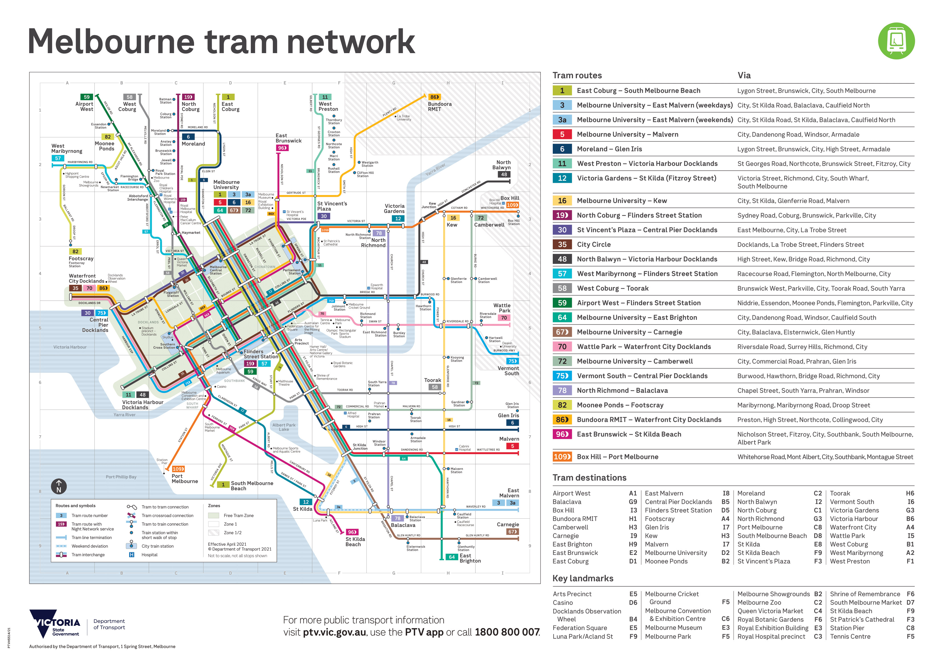
Earlier in May, the Department of Transport released the first major update in four years to Melbourne’s tram network map. We don’t get very many official public transport map updates in Victoria, so when they do happen they are extra exciting!
You can see a video version of this post using the link below:
I’m going to go through some of the key differences here and try to figure out what has changed. This is not an exhaustive list, I’m just highlighting some of the main changes.
A link to the new map is here and old one is here. You can also compare the old and new maps with the image slider below.

New things
The map designers have added a number of new features to the map. Some of these have been talked about for a long time since the 2017 design was released, and others are new to the scene.
1) Street names
One of the main criticisms of the previous map was the omission of street names. The previous map design (originally released in 2011) had included them and the general feeling seemed to be that leaving them out in the 2017 design made the map harder to read.
This new map has reintroduced street names, which is great. This will be of more benefit to visitors and infrequent travellers than regular passengers, but they are more likely to be the ones using these maps anyway.
2) Landmarks
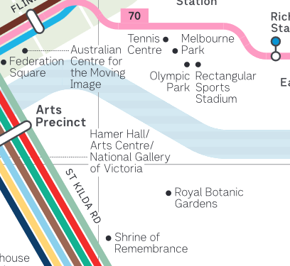
Another feature of the 2011 design that has made a comeback is major landmarks. Similar to street names, this was a common criticism of the 2017 design that left these out. Even very significant places like the MCG were not shown. This new map has brought in 33 major landmarks, each indicated with a small black dot, which is great to see.
A related addition to the map is a ‘Key Landmarks’ index in the legend in the bottom right hand corner. This is a nice touch that I think is worth including. There are some questionable names in here though – e.g. ‘Tennis Centre’ (more commonly known and signed as ‘Melbourne Park’ or ‘Melbourne & Olympic Park’) and ‘Stadium Precinct – Docklands’.
Moreover, not all landmarks shown on the map are included in the legend. As I’ve said before on other cartography design, you should either include all or none of any information you want to convey on a map. Including only some things is worse than including nothing as it just creates confusion.
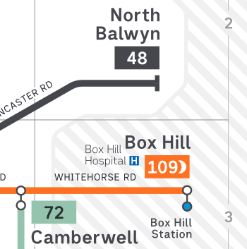
3) Hospitals
Major hospitals have now been added to the map. This is an interesting design choice that’s worthy of mention on its own, because I’m not sure why hospitals specifically have been added and not other features. This may be because many people use trams to access these health services – I’m not sure.
There are one or two omissions though. Footscray Hospital, despite being very close to the Ballarat Rd/Gordon St stop on Route 82, is missing, as well as the Eye & Ear Hospital near St Vincent’s Plaza and Routes 11/12/30/109.
4) Albert Park Lake
Not really much to say here other than I have no idea why this has specifically been included – no other major water bodies have been added beyond the Yarra River and Port Phillip Bay. Perhaps it’s a local landmark, but otherwise I can’t see a reason for its inclusion.
Changes
This is where it gets really interesting. There appears to have been quite a bit of thought into updating and improving existing things on the map. Some of these work very well, others not so much.
1) Terminus names are much bigger
This is probably the best single thing about this updated map. Termini are very important for Melbourne’s trams because that’s how we typically identify a particular line. True, they also have route numbers, but these are almost always displayed alongside the terminating destination.
On the previous map, the font size for terminus labels was the same small(ish) level as railway stations and CBD street names; even the Yarra River label was slightly larger. This made it much more difficult for someone unfamiliar with the network to figure out where termini were located.
This new, larger label size for termini names (and route numbers) are a big improvement in my opinion.
2) Lines are less straight
Something that’s less of an improvement is the design change made to the alignment of tram lines.
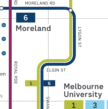
On the previous map, the lines were significantly simplified and straightened. In my opinion, this made them easier to follow – especially when showing interchanges. A lot of this has been retained on the new map, which is good, and some additional twists and turns have been shown.
By the look of it, many of these bends have been included and/or exaggerated for design rather than useability reasons. For example, the bend of Elgin Street in Routes 1/6 is significantly larger than real life (which is just a few hundred metres). This appears to have been done to accommodate the larger terminus label for the Route 6. There’s nothing necessarily wrong with this approach, but some of the bends (e.g. Errol Street on Route 57) don’t seem to have been included for this reason and I think these make the map look more cluttered.
On a related note, there is one important exception to this change of making things less straight! The Route 78, previously shown with a significant bend in South Yarra, is now completely straight. This reflects its real geography as the only tram route that runs in an (almost) entirely straight line.
3) Station names have been changed
Connecting railway stations now have “Station” appended to their name, a minor change that I think is quite helpful. I think this is an improvement for map users.
This is because it may not be entirely clear that these little blue dots are railway stations to someone unfamiliar with Melbourne or its transport network. Adding this single word makes this one less thing to check on the legend, which is always a good thing.
Improvements needed
As I said, overall I think this update is a great step forward for Melbourne’s tram map. There are lots of things that have been fixed and new ones that have been added. But I still think there are a couple of improvements that can still be made in the future.
1) Add major interchange names
One of these is labelling interchanges. A couple of tram interchanges are labelled on the map which is a great addition. For example, Abbottsford Interchange and St Kilda Junction. However, there are many more missing, such as Hawthorn Bridge and Camberwell Junction.
As I said above, either all or none of these labels should be included. I think they are a worthwhile addition and at the very least the significant ones should be listed. Not labelling them reinforces a CBD-centric view of the network, which may have been relevant in the past but is becoming increasingly less so.
2) Publish the map as a vector file
UPDATE: Thanks to @transitmaps for pointing out that the map is indeed published as a vector file. I wrote/filmed this content before 27 May so it seems to have been updated since then!
Another small but noticeable change is that the PDF file of the map is in raster and not vector. Basically this means that you can only zoom in a certain amount before the map starts to appear blurry. It also makes the file size larger, is less SEO friendly and is not compatible with devices to improve accessibility (e.g. screenreaders).
I can’t think of a reason why this was done deliberately so maybe this is just an error that will be addressed soon. Given that this map is slightly larger than the previous design (and no longer readable on an A4 piece of paper), being able to zoom in to closer levels is important.
A big improvement
A lot of this is just me being a bit pedantic. In general, this is a great map that builds on the design work that was done to introduce this new style over four years ago. I’m guessing that we won’t see another major update to this map until the Metro Tunnel is finished in 2025 and the promised tram route changes will take place.