

Inspired by this project from Andrea Spinosa in Italy and Australian Rail Maps, my mission is to create a unified design for all heavy and light rail passenger networks in every Australian city.
Map Design

The aim of this project is to create a unified design language for all of Australia’s heavy and light rail networks.
I have included each city map in the section below in descending alphabetical order with specific design notes for each.
Map notes
Non-urban trains with fewer than one train per day are not included
For the purposes of this map, ‘light rail’ only includes lines that are entirely or almost entirely separated from general traffic
Buses, ferries and other non-fixed-rail transport are not included
All non-urban trains are shown in grey for simplicity, except for V/Line routes (which all have the same colour designation)
Indigenous nations/place names are from official government sources
Design rules
4pt lines for heavy rail, 2pt lines for light rail
6pt grid
45 degree angles
All labels horizontal
8pt font for stations, 10pt (bold) for interchanges and termini
Freesans font used under GNU license (link)
Line colours are identical to official allocations for each network, except for non-urban lines which are a standard grey (download colour palettes that I used here)
The Maps
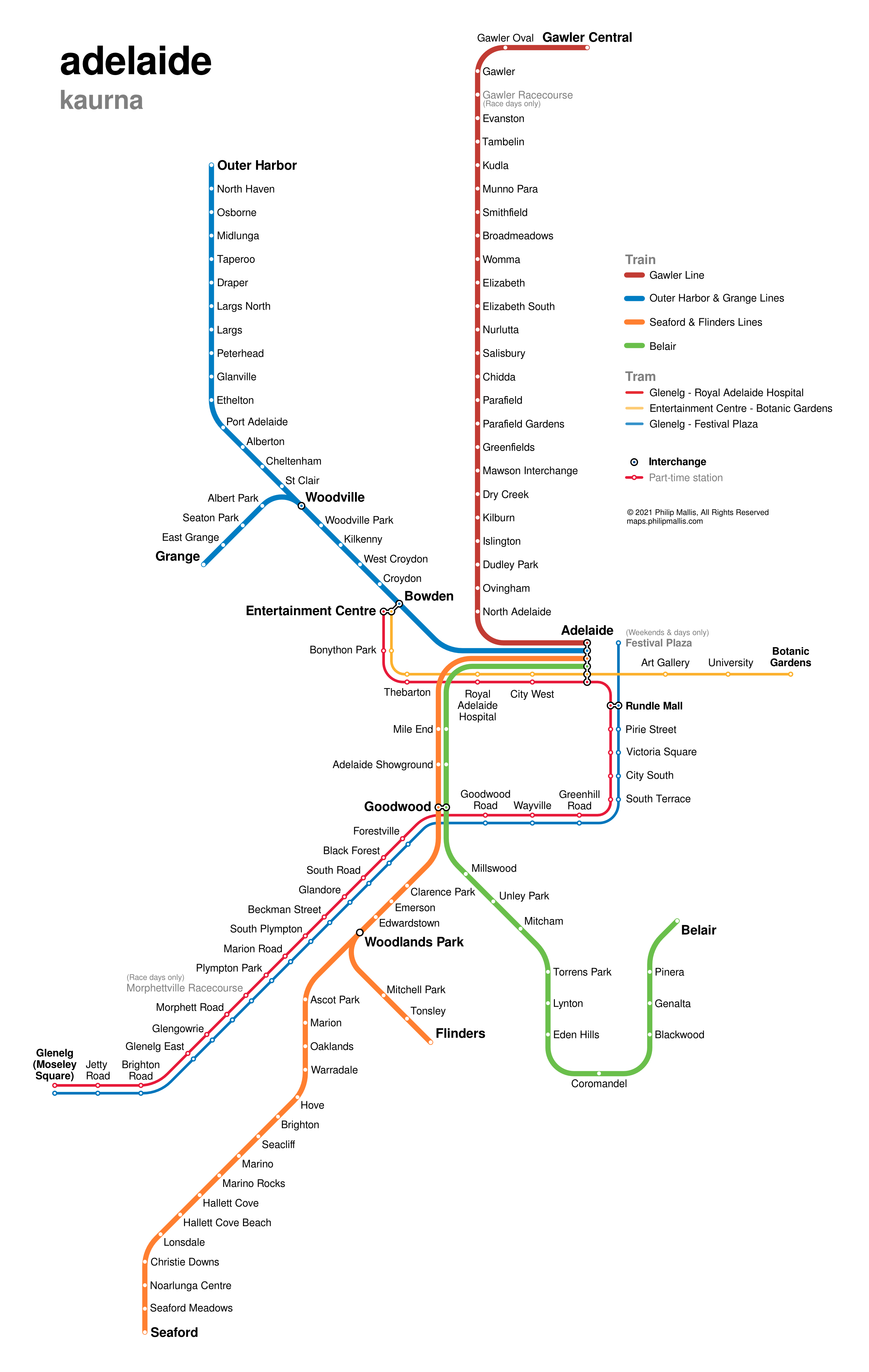
Adelaide
I have previously mapped Adelaide but went back to the drawing board for this project.
The city has six heavy rail lines and three light rail lines. Two of the six, Grange and Flinders (formerly Tonsley), are grouped together with the Outer Harbor and Seaford Lines respectively due to their short reach.
One of the curiosities of this map is that Adelaide is the only one with each light rail line marked differently. Sydney, despite also having three light rail lines, brands them all as the same shade of red – except, strangely enough, on their light rail network map (but more of that later).
There are also three part-time stations – two at racecourses – at Gawler and Morphettville. The latter and Festival Plaza are on the Glenelg tram line, which might make them the only part-time tram stops on any Australian tram network (as part of regular service). I’m not one hundred percent sure but I can’t find any others. Please let me know if I’m wrong.
Brisbane
Brisbane’s rail network consists of several very long lines. This makes reconfiguring the design to make it more space-efficient and easier to read quite a challenge.
I have straightened out the trunk lines between Northgate and Roma Street for the sake of simplicity and to fit the Ferny Grove and Exhibition Lines into the frame more easily.
A few other differences from the official map include:
- Adding the ‘kink’ in the Cleveland Line to help with identification
- Including the part-time rail link between Yeerongpilly and Corinda
- Excluded non-Brisbane sections from the map

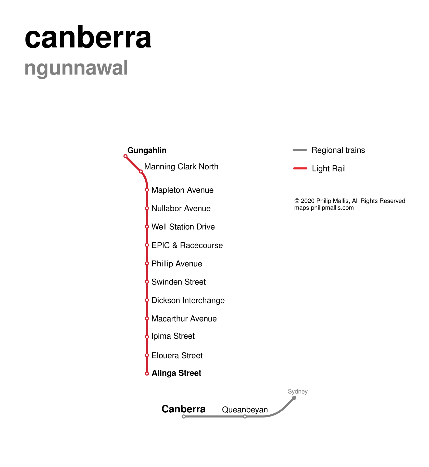
Canberra
Canberra is probably the sparsest map of this collection. It does have an extensive bus network but this is not shown on this map due to the scope of the project.
There are only really two lines that meet the criteria here: the light rail route between Civic and Gungahlin, and the regional heavy rail service into New South Wales. These two don’t connect so I didn’t even need an interchange dot in the map legend!
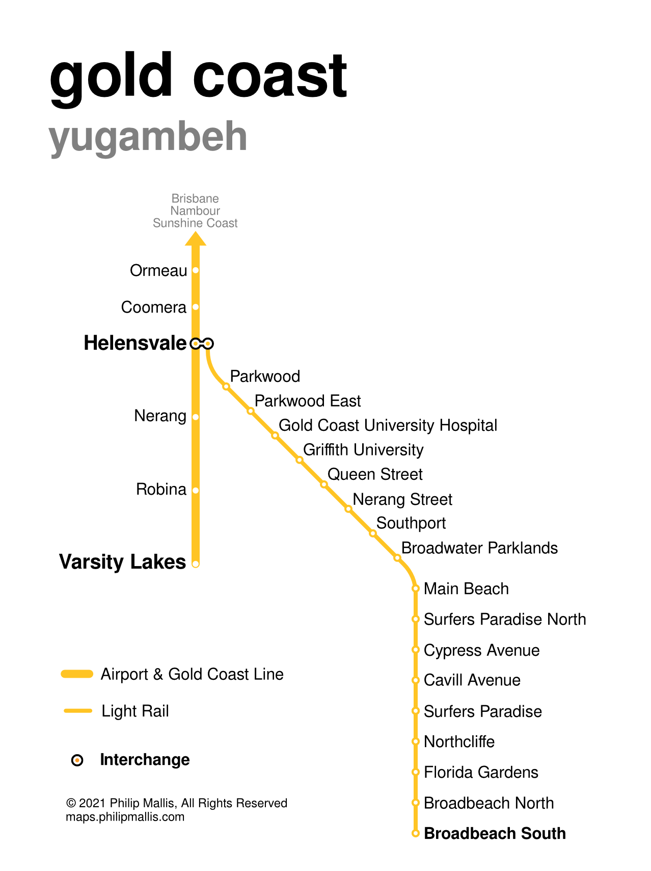
Gold Coast
This one is a little confusing as Translink uses the same colour to brand the Airport/Gold Coast Line as it does for the G:Link light rail.
I have also spaced out the stations south of Helensvale a little more than to the north to help account for the large spacing compared to the light rail stops. This helps to reduce the scale distortion when comparing the location of Varsity Lakes to Broadbeach South. It’s still significant, but not ridiculous as it would have been with consistent station spacing.
On a somewhat relevant sidenote, I do like the way that the G:Link stops are named. Rather than relying entirely on street or intersection names. the planners seem to have made an effort to create more distinctive and location-specific names. This all makes it easier to navigate the network.
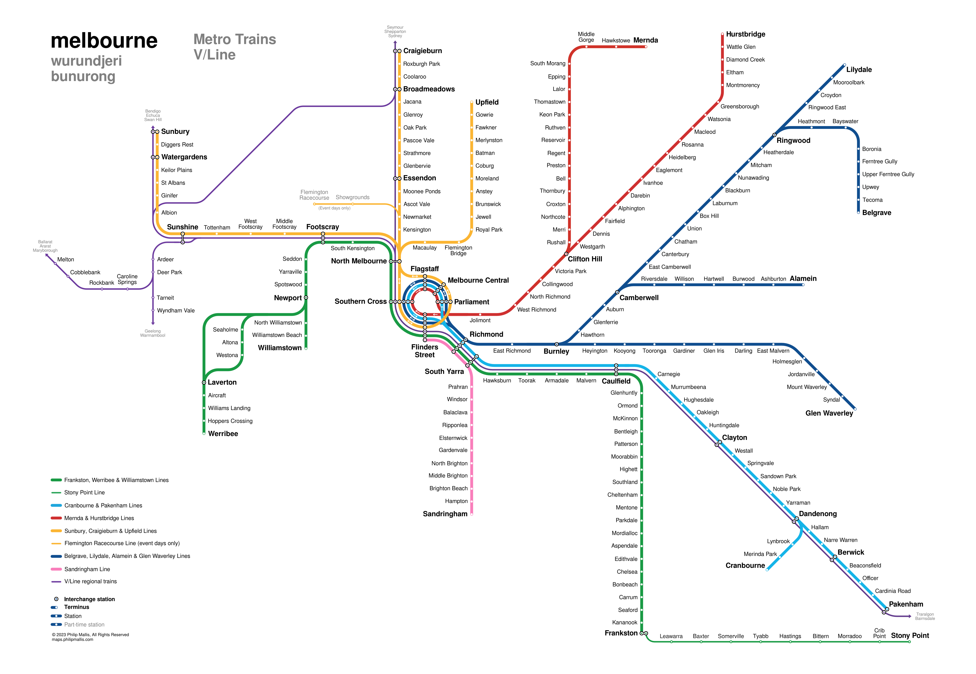
Melbourne
As with Adelaide, I have mapped Melbourne’s rail network quite a few times before. As it’s the place that I know best, it took me a long time to come at it from a genuinely fresh perspective.
I have included some tweaks and design solutions that I had been thinking about for a while. These include:
- Making the City Loop designed as a ‘proper’ circle shape
- Simplifying the Dandenong corridor, including branching off the Cranbourne Line on a 45 degree angle to save some space at the bottom of the map
- Designing the Ringwood corridor as a largely 45 degree angled line to save on space and make it easier to follow
- Eliminating the need for a kink in the Sandringham Line south of South Yarra
Eagle-eyed readers may have also noticed that this map reflects the upcoming timetable changes; most notably removing the Frankston Line from the City Loop (at least until the Metro Tunnel opens in 2025).
Overall, the map is smaller than the PTV map (even accounting for the absence of regional stations and lines) and I think improves its legibility. It would need a redesign when the Metro Tunnel finishes and if the Werribee Line is connected to the Regional Rail Link, but that’s in the future.
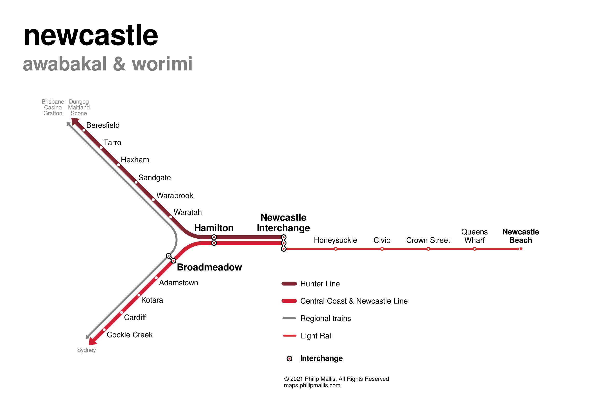
Newcastle
As a relatively small city, Newcastle has only has three rail services: one running south to Sydney, a regional train heading west and the self-contained light rail connecting the city centre to Newcastle Interchange. The railway was truncated a few years ago make way for the city’s new light rail system.
As a linear system, there isn’t much room for change in the fundamental design. The main thing I have done is straightened out the lines to form a sort of rotated Y shape.
On a related note, the official map is not great. I might actually come back at some point and do a revised network map including all public transport routes as a frequency map.

Perth
This map was both frustrating to work on and very satisfying to complete.
I have to say that out of all the existing official network maps, Perth’s needs the most work. Not only is it incredibly difficult to find a map of the rail network (they are all much larger network maps), but the map itself does not seem to have been updated in quite some time.
Given the ‘spiders web’ nature of the network with lines extending in all directions, I have based the design on four 45 degree angle axes. The Mandurah Line extending due south is the outlier but I think the general concept still holds.
The most frustrating aspects of making this map were:
- Trying to find a way to make the Perth Station interchange work – the odd angles and different colours did not make this easy
- Finding a way to represent the Mandurah/Joondalup Line – the parameters of this project meant that I could not alter the colours (otherwise I would have just shown this as one line colour instead of two)
- Figuring out the stations where non-urban trains stop – the regional and urban transport maps are quite separate. The regional one is also difficult to find and read.
This is another network that I would like to come back to and map with a bit more latitude. Given the heavy reliance on buses, this map would also include public transport other than just trains.
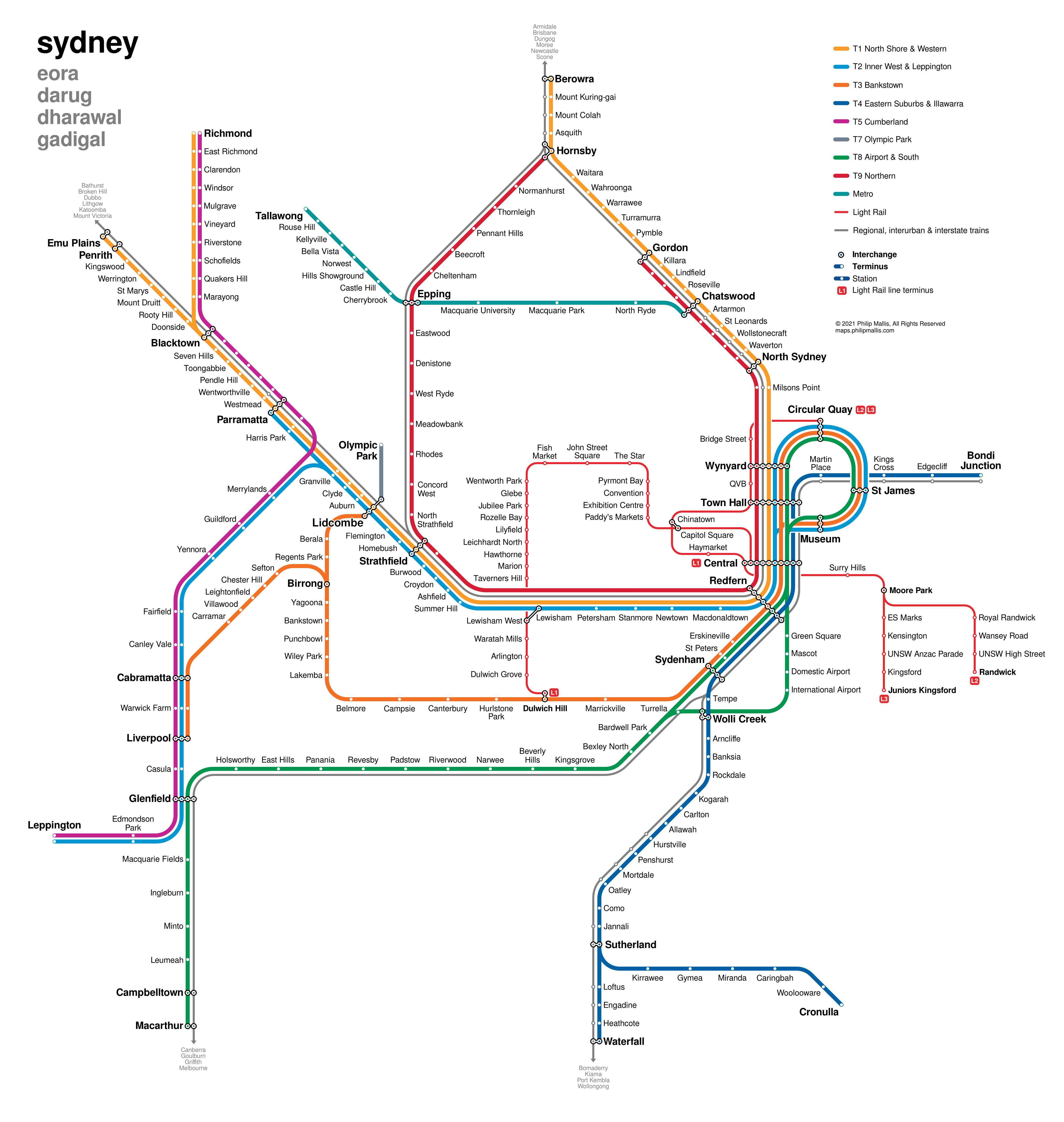
Sydney
Sydney’s network is huge and complex. Out of all the rail systems in Australia, this one is the least radial. This generally means more freedom to play with the alignment of lines and stations.
A few specific design notes for this map:
- The Lidcombe Station label placement is not ideal, but I could not for the life of me find an alternative without huge impacts on the rest of the map.
- Route alignments are quite different closer to the CBD. This is mainly to include the three light rail routes which are not shown on the official rail network map.
- I have not included any lines under construction as I don’t believe that these belong on operational network maps.
Making the light rail routes fit into the inner city was not easy – especially the interaction between the L1 and L2/L3 routes around Chinatown and Central Station. But now that the full network is on one map, you can see the potential utility connecting different lines and servicing areas that aren’t serviced by heavy rail.
FAQs
To anticipate some of what I assume will be fairly common questions, I’ve included some additional answers below.
Why haven't you included Metronet, the Sydney Metro extensions or the Melbourne Metro Tunnel?
This map is not designed to show every possible station or line. I have based this network on what is currently ‘on the ground’ in regular passenger service as of December 2020 rather than any additional infrastructure that is under construction or proposed. I explain why in this recent post.
Why aren't trams in Melbourne included?
For the purposes of this project, I am only mapping heavy and light rail systems. ‘Light rail’, in my book, means a light railway that is completely or almost completely separated from general traffic – i.e. it operates in its own right of way. No tram line in Melbourne currently meets these criteria. Even the 96, which runs along the former railway to St Kilda, still has a relatively long section of mixed traffic conditions on the northern end of the line.
Where is Skybus?
Skybus is not a train or tram. Therefore, it is not included in this map. See my other thoughts on this topic in my post here.
Why are lines coloured and named like this?
The purpose of these maps is not to reorganise or otherwise rebrand any lines. I have used the exact colour profile of each line as used by the official public transport agency for each city/state.
This created some challenges – especially with through running lines (e.g. Perth and Brisbane) – but I have found workarounds for each situation.
Where can I get a high resolution copy of the map?
The network maps are available to see on this webpage at a lower but still readable resolution.
If you are after a higher resolution map, it soon will be listed for sale in several forms over on my shop page shortly. These will include prints and posters.
What information did you use to make these maps?
I mostly relied on OpenStreetMap data for the maps.
Future Development
As always, if you have any feedback or suggestions for improvement, please let me know.