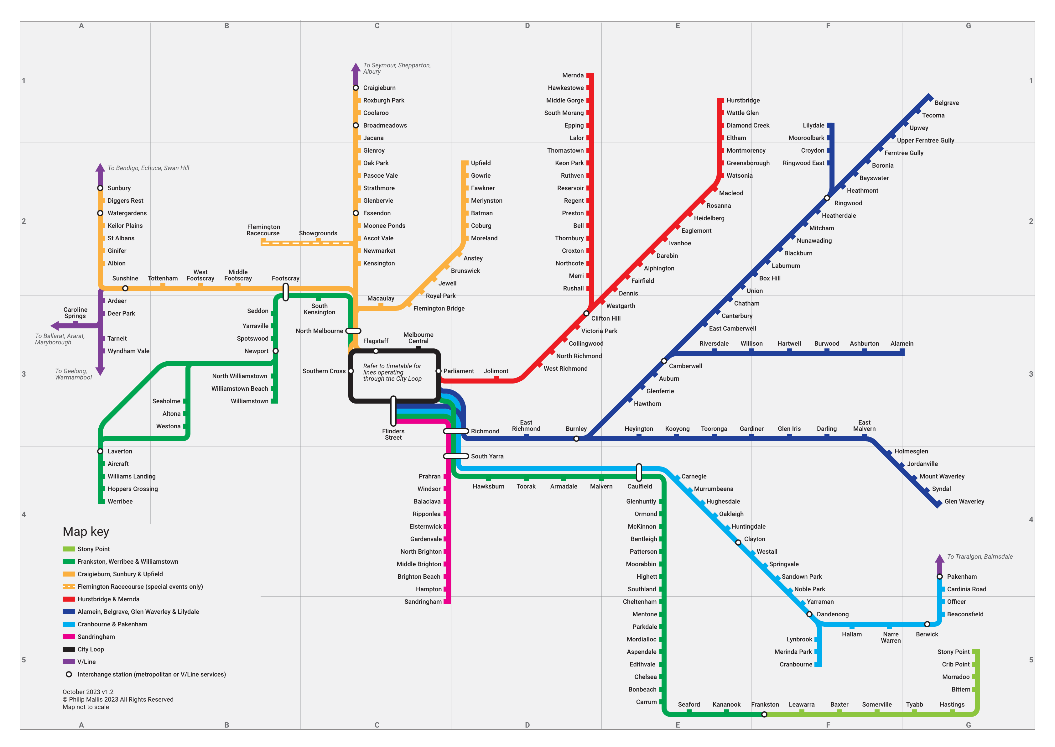
UPDATE 12/10/2023: I’m pleased to release version 1.2 of this map, which is now available on this page. The main change is that Union Station has been added, and Surrey Hills and Mont Albert removed. Some other minor changes have also been made. Enjoy!
One of the best things about the London rail network is the pocket map. This is a small, foldable version of the iconic Tube map that is easy to carry and is full of information.
In my opinion, it is a brilliant design – just as much as the map that it contains. It folds to only a double-sided A5 piece of paper but contains an incredible amount of useful information without being too cluttered. As much as the map itself has its own identify, Transport for London (TfL) have managed to create a separate identity centred on this portable map by commissioning local artists to design covers. These have now become collectable items in themselves.
Inspired by the experience of using this compact transport guide, I have made my own version of the current ‘Victorian Train Network‘ map published by PTV, designed to be printed and folded into a small size.
I was planning to print these to be available for people to use. However, I learned just after finishing this project that PTV have already developed their own version as part of the myki Explorer pack. This ruined my plans a little so instead I am just releasing it here instead in case anyone still finds it useful.
The Network
There are 17 passenger rail lines in metropolitan Melbourne. It caters for over 240 million trips each year across its 218 stations. Largely radial in nature, it is a surprisingly difficult network to map.
This is mainly because the CBD is the only real focal point due to almost all lines converging on a single station (Flinders Street). Having this sort of network setup means that it is very unusual to have anything else as the centre of the design and, in all likelihood, would make things unnecessarily confusing for map users in this sort of project.
The Map
I have written before about the current PTV rail network map. Overall, it is a good depiction of Victoria’s railways and does a decent job at making it all fit on a page that is readable on a relatively small poster.
This project has three key aims:
- Create a map that folds into a size small enough to be easily carried in a pocket or wallet;
- Improve and expand on relevant transport information; and
- Rationalise some design elements of the map itself.
Users of the current PTV map will notice some key changes to the line diagrams. Some of these have been made to make the map fit onto a small piece of paper; others are things that I would have liked to change anyway.
Some of the things that I have changed are:
- Straightened out lines (e.g. Mernda, Belgrave)
- Amalgamated the Stony Point Line into the Frankston/Werribee/Williamstown Line (see below for further explanation)
- Moved station information to a separate page
- Added extra station information, particularly for accessibility
- Simplified the City Loop (see below for further explanation)
Also note that regional services are not included except where in metropolitan Melbourne, as this is only particular project is designed to cater for users of the metropolitan rail network.

Line groups and colours
To avoid unnecessary confusion, I have stuck with similar colours for each line group on the current PTV map. However, I have slightly tweaked the groups themselves.
For a start, I have listed each line with the group in alphabetical order. This is a small edit but I think it makes the list easier to read.
I have also combined the Stony Point Line into the Frankston, Werribee & Williamstown Line colour. It’s a hangover from many decades of previous maps to show the Stony Point Line as a separate and special service. We have gradually been moving away from doing this, but I don’t believe that the current PTV map doesn’t go far enough. In sum, I can’t see any reason why it needs to be in its own special group. Fewer colours and groups makes the list simpler and easier to understand.
Another small difference is that the Flemington Racecourse Line is depicted in the yellow colour of the Sunbury, Craigieburn & Upfield Line instead of the grey colour on the PTV map. Given that some Racecourse Line trains do stop at stations between the CBD and Showgrounds, it’s worth showing it as part of that group.
On an older version of this map, I had renamed the groups to make them shorter and give them an identity. However, I changed this back as I feel that this warrants its own map and discussion. For simplicity, I’ve kept them more or less the same as they are currently shown on the PTV map.
City Loop
The City Loop deserves special mention here because of its divergence from the PTV map.
Until the current official PTV map, the City Loop had always been depicted on official maps with a single line. They did not attempt to show the way that each line interacted with this core part of the network. You can see examples of some here.
I have chosen to return to this thinking, but in a limited way that I hope is a good compromise between the new PTV approach of individually showing every line and the old The Met design where lines that met were amalgamated into one.
As you can see, metropolitan lines are all shown individually on the map except where they form part of the same line group (defined by PTV, as outlined above) or when they enter the City Loop/Southern Cross Station. I do not think it is a good use of map space trying to unravel the incredibly complex stopping patterns, directions, etc. that different lines take at different parts of the day. No map should try to display all possible information – it is all about finding a balance between simplicity, ease of use and providing sufficient information.
Instead, I have indicated this central area with a single black line and a note referring potential users to the timetable. To my mind, for the purposes of this map, I think that this is a much better way of communicating this complicated and ever-changing information. Timetables are specifically designed for this purpose and are better suited to the task rather than a map like this.
Station index
Similar to the Tube pocket map, I have included an index list of stations on the reverse side of the page. It includes stations names in alphabetical order with a series of small icons to indicate facilities.
Full wheelchair access
Stations that are fully accessible to people in wheelchairs without assistance. These generally include lifts, but must also have ramps or other station access points to all facilities that are DDA-compliant.
Partial wheelchair access
Stations that are only partially accessible to people in wheelchairs. This includes stations that are only partly fully accessible or have ramps that do not meet DDA standards.
Bicycle parking
Stations that have secure Parkiteer bicycle parking. Designation of this icon does not include public bicycle hoops.
Car parking
Stations that have car parking for public transport passengers. This only includes carparks that are specifically designated for this purpose.
Future Development
I was planning to turn this map into a sort of brochure suitable for printing. But unfortunately I only found out after I’d completed this project that PTV already has a version of its own.
As a result, I have released the full PDF here for general use. It is designed to fit on an A4 page and to be folded in a Z-fold brochure format, with the option of an additional horizontal fold as well. This should make it fit into most pockets and wallets.
If you have any feedback or suggestions for improvement, please let me know. I have set up a very short survey where you can provide your feedback here: http://tinyurl.com/trainmapsurvey

