Victoria is not well-known for its transport maps in the same way as London or New York. Despite this lack of enduring iconic design, the state has a rich and interesting history of railway maps.
Almost all transport maps were geographical rather than schematic up until the 1990s. Only then did we see a shift away from physical geography to more abstract depictions of lines.
The easiest way to see some of these historic images is searching through the State Library of Victoria’s online catalogue. Some materials are not available online but you can easily access them at the Library in person. This post is by no means a comprehensive list but I have included some of my favourite maps in the content below.
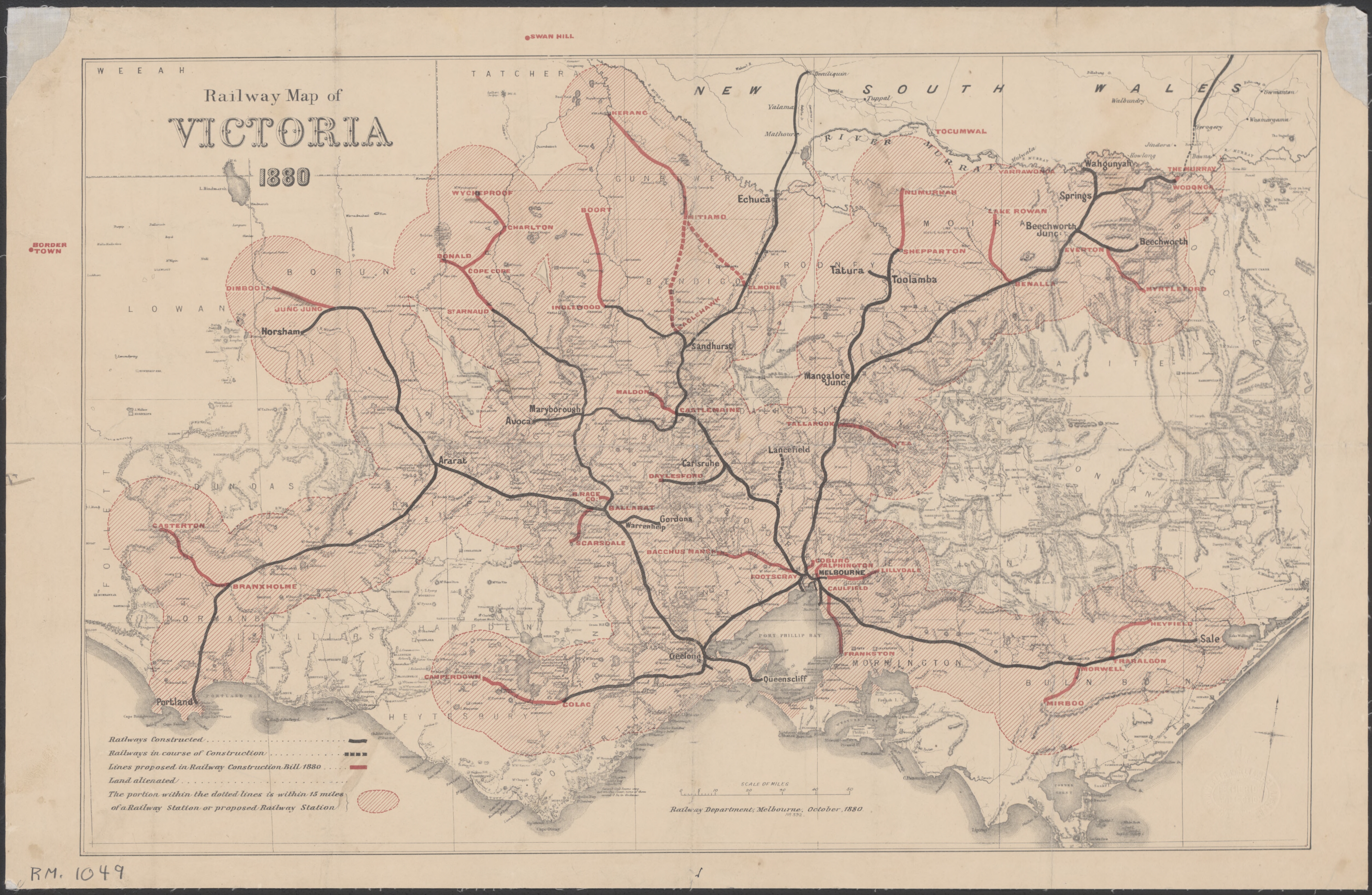
1880 Victorian Railways Map
Link: http://nla.gov.au/nla.obj-231398700 (Source: National Library of Australia)
One of the earliest rail maps available online is this 1880 work showing the statewide rail network. At the time, the important Railways Construction Bill was passed by the Victorian Colonial Assembly which approved the construction of many new lines and stations. There are lots of interesting things to note about this map but I’ll stick to just a few.
Perhaps the most obvious feature of this map is the shaded red areas around the railway lines. This indicates land within 15 miles (about 24 kilometres) of an existing or proposed railway station. Even with the relatively small network of 1880, large portions of the state already fall within these areas. It is not clear why 15 miles was chosen as the distance to be measured but it is interesting to see how early transport planners were conceptualising network coverage in the 19th century.
This is one of the few official rail maps that includes topography and other natural features. Mountain peaks and rivers are drawn in great detail and have been meticulously labelled. It looks like somebody took an existing physical geographic map of Victoria and simply drew the railway lines over the top.
Dotted lines indicated railways that were under construction at the time that the map was made. Red lines indicate those proposed in the Railways Construction Bill.
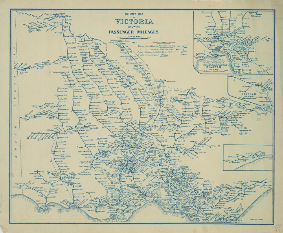
1927 Victorian Railways Map
Link: http://handle.slv.vic.gov.au/10381/120386 (Source: State Library of Victoria)
This is a beautifully detailed map of the Victorian rail network as it stood in 1927. This was probably the zenith of the network’s extent and shows hundreds of stations and tens of lines that do not exist today.
One of the most interesting features of the map is that it displays each station’s distance (in miles) from the centre of Melbourne. For northern lines, the distance is measured from Spencer Street Station whereas for southern lines this is calculated from Flinders Street Station. It also shows ‘local mileage’ from major junctions.
The sheer size of the network shown on this map never ceases to amaze me.
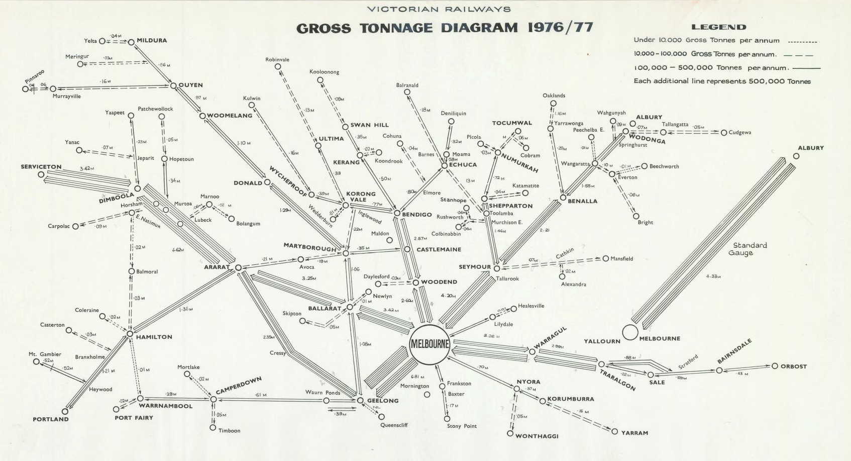
1976/77 Victorian Gross Rail Freight Tonnage Map
Link: http://handle.slv.vic.gov.au/10381/157561 (Source: State Library of Victoria)
For something a little different, this map shows the gross tonnage carried between sections of the Victorian rail network for 1976/1977.
Looking at lengths of track, such as between Geelong and Melbourne, displays the huge volumes that used to be carried on the network in Victoria (6.81 million tonnes on this map). You can also see how much freight was carried on the standard gauge track to Albury and beyond into New South Wales (4.33 million tonnes).
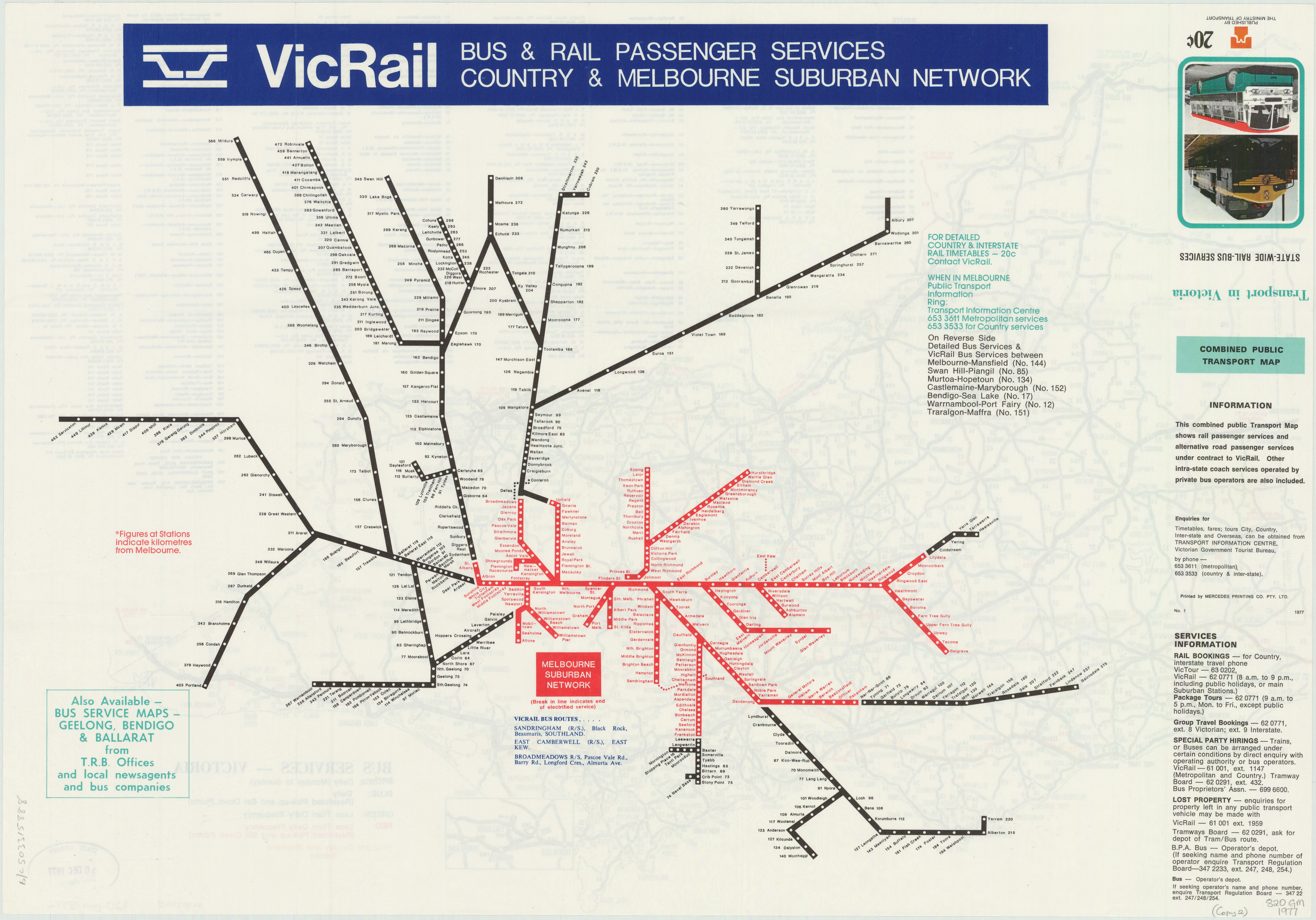
1977 VicRail Train and Bus Maps
Link: http://handle.slv.vic.gov.au/10381/157628 (Source: State Library of Victoria)
I love this first map. It is one of the few schematic depictions of the transport network that seem to have been made before the 1990s. It shows the train services run by the rebranded Victorian Railways Board (or VicRail as it was then known) at the time, as well as a few rail bus routes.
Only two colours are used; red and black, for showing electrified and non-electrified services respectively. I am not entirely sure what the design rules would have been for this map, but it seems to have been made using variations of 10 degree angles. Some of the station spacing on the metropolitan network doesn’t match (e.g. the Belgrave Line).
Regional stations also have the distance from Melbourne indicated next to their names and there is a geographic map of every regional bus route on the obverse.
Also note that Port Phillip is not included on the map as it has been in more recent designs.
Link: http://handle.slv.vic.gov.au/10381/139729 (Source: State Library of Victoria)
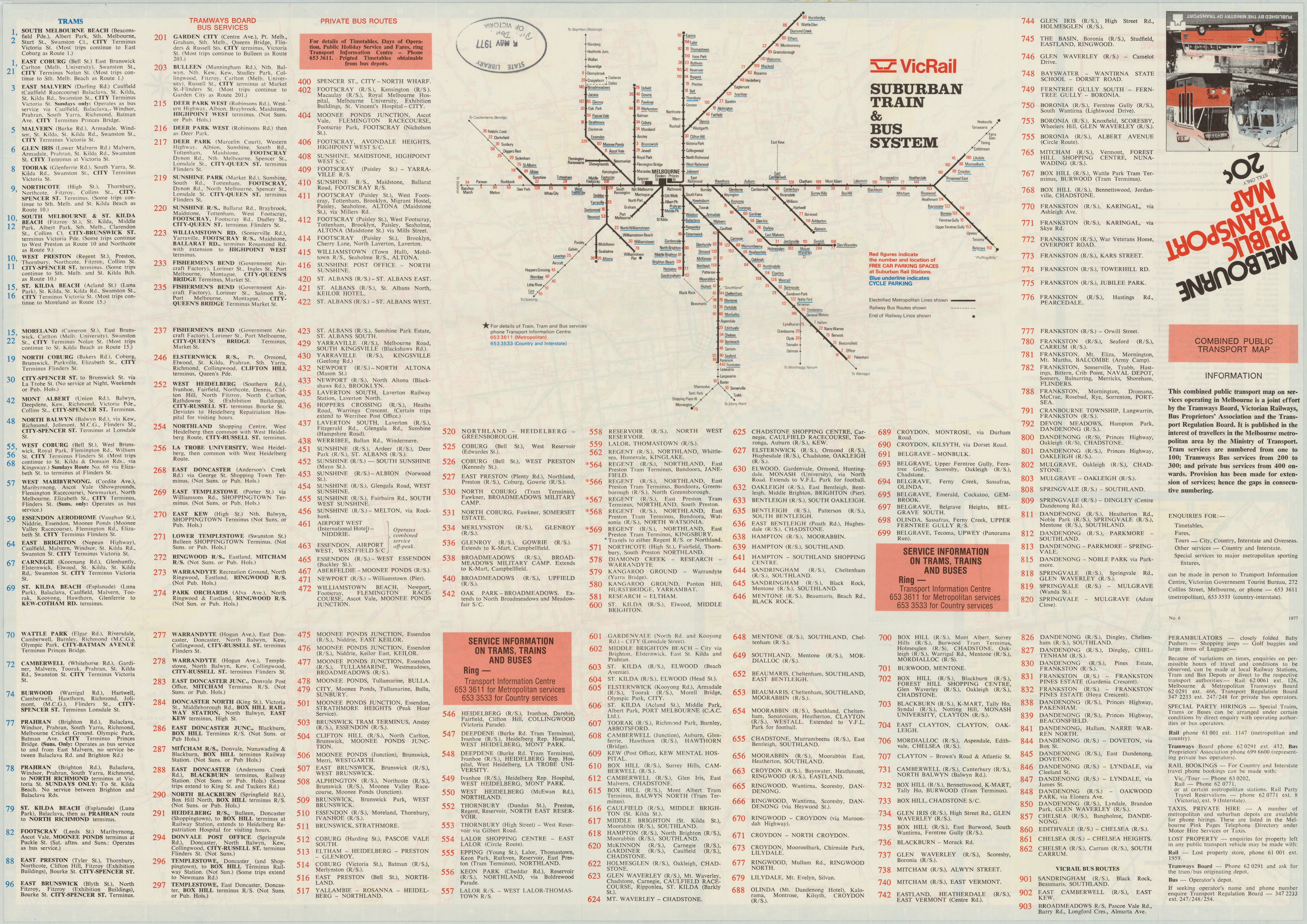
Another map published in 1977 was this fold out brochure issued by the Victorian Ministry of Transport. This is another schematic map of Melbourne’s metropolitan rail network, but the brochure also features a geographic map of every bus, tram and train service in the metropolitan area on the other side of the paper.
According to the Bus & Coach Society of Victoria (who also have a bunch of interesting maps on their website), these maps were first printed in 1971 and were issued into the 1990s.
What is particularly interesting about the schematic map is that the number of car and bicycle parking spaces is indicated at each station. I haven’t done a detailed analysis but it would be interesting to compare these 1977 figures with the contemporary numbers of parking spaces at stations. One of my previous mapping projects might help with that if anybody is interested.
1994 The Met Melbourne Rail Map
Link: https://melbourneoldschooler.blogspot.com.au/p/train-history.html
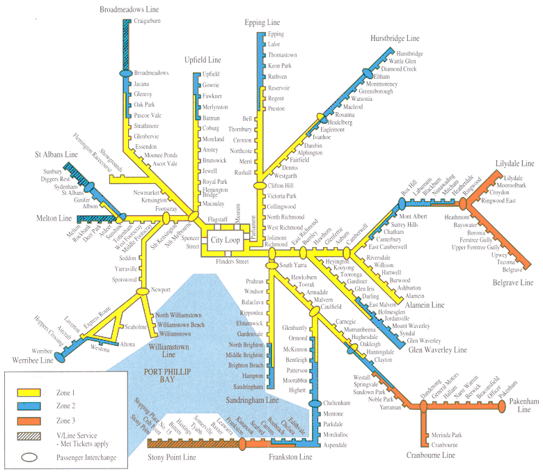
This is one of the first iterations of the iconic map design that remained more or less unchanged for more than two decades. Colouring according to ticket zones rather than individual lines is uncommon but this type of map was one used by The Met and most of its successors for Melbourne over this time period.
When zone 3 was abolished in 2007, the red colour disappeared to be replaced by the zone 2 blue. The rest of the map remained the same, other than a change of font and a few other tweaks.
The big white space between the Belgrave/Lilydale Lines and the Hurstbridge Line was not to be filled until the latest 2017 PTV network map with a reconfiguration of line locations.
2000 Hillside Trains Map
Link: https://www.flickr.com/photos/ptua/1201793231 (Source: Public Transport Users Association)
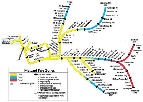
After the privatisation of rail operations in the 1990s, Melbourne’s metropolitan rail network was split into two operators: Hillside Trains (north-east) and Bayside Trains (north-west, south and west). Unfortunately, the operators had separate maps of their own networks, as this map shows. For example, if you were at Camberwell Station in Hillside Trains territory, you would not be able to find a map or any information about any Bayside Trains line.
From a design perspective, these 2000s-era maps are interesting as well. They seem to be the only official schematic maps for Victoria that do not follow sharp angles or straight lines. The railways are seen to curve in particular directions (not along any standard angles, mind you) which gives the lines a somewhat graceful appearance.
This map also includes the number of parking spaces at each station adjacent to the name.
You can also find a lot more Melbourne transport maps from this era in this great Imgur gallery compiled by Marcus Wong: https://imgur.com/gallery/Ns4tP
2017 PTV Victorian Train Network Map
Link: https://static.ptv.vic.gov.au/Maps/1482457134/PTV_Train-Network-Map_2017.pdf (Source: Public Transport Victoria)
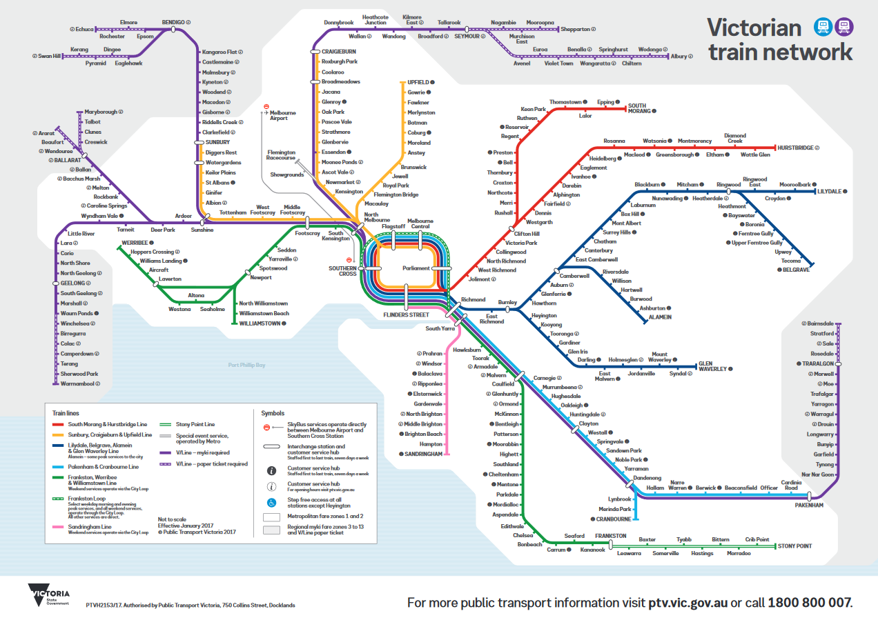
We seem to have come full circle in map design! After decades of separating the regional and metropolitan railway lines, they have been brought together onto the same map in the present-day version of Victoria’s rail system.
I must admit that this design took a little while to grow on me. After years of being used to the zone-based maps of the 2000s and early 2010s, the new colour system was quite jarring at first. I now concede that it is a good design with some improvements from the old Metlink maps. However, I still miss the icons showing connections to other transport services and I think that the ‘customer service’ indicators should be clarified to show premium and host stations more clearly.
4 Comments
Join the discussion and tell us your opinion.
How on gods earth there is not a train from Bendigo to ballarat or Bendigo to Geelong is buzzard,,, agree..
Shocking you cannot see anything
Where is Mernda in the 2017 map?
Hi K, Mernda Station didn’t open until 2018