

There is seemingly no end to the number of fantasy rail maps for Melbourne.
This is my contribution.
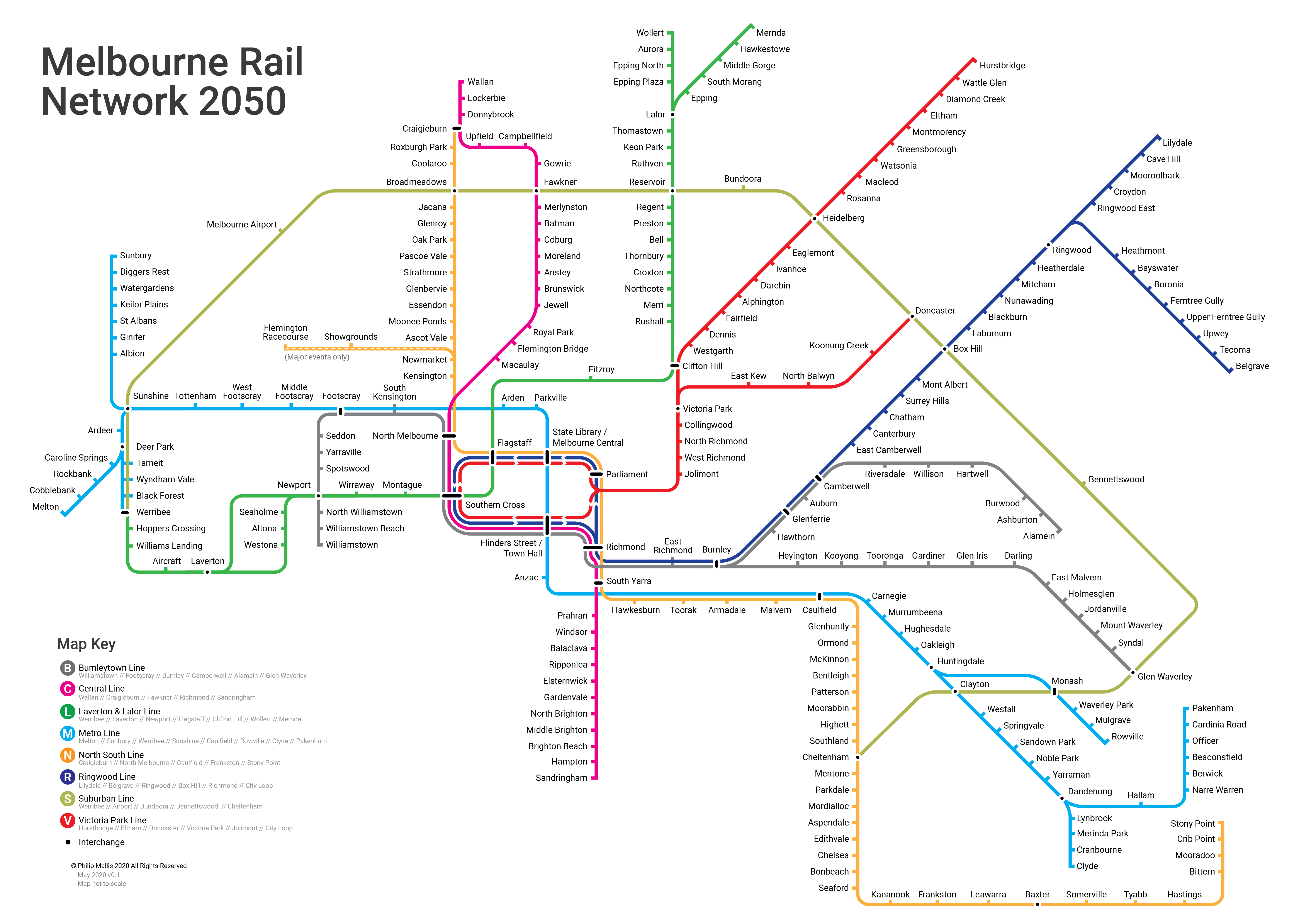
The Network
Melbourne will look very different in 30 years. Our population will certainly be higher, the suburbs more sprawled and demands on our transport system greater.
Successive departments and agencies of the Victorian Government have developed strategies to alter Melbourne’s rail network to meet these expected changes. Unlike the 1970s, this means expansion rather than contraction.
Rather than assume unlimited budgets and resources, instead I have used these documents to inform this map. They include the PTV Network Development Plan, Growth Corridor Plans and the Victorian Transport Plan.
Some of the changes shown in the map that differ from the present-day network include:
- Reorganisation of the network into nine lines with their own distinct colour and name
- New branch line to Wollert from Epping
- New branch line from Victoria Park to Doncaster
- New branch line from Huntingdale to Rowville
- Electrification of railway to Melton
- New Suburban Rail Loop constructed
- New Melbourne Metro 1 constructed as per most recent plans
- New Melbourne Metro 2 constructed connecting Clifton Hill to Newport via Fitzroy, the CBD and Fisherman’s Bend
- Electrification of railway to Wallan
- Reconfiguration of the City Loop and ensuring consistent service direction
- Extension of Cranbourne Line to Clyde
- New station at Cave Hill
I would like to emphasise that this map is not meant to show every possible or proposed extension, nor as any sort of advocacy on my part about what should or should not be built. This is simply showing what the network could look like by 2050 on its current planning and construction trajectory.
One area that I do want to talk about in a little more detail is in the outer western suburbs. I tested out several options when it came to how the electrification of the Regional Rail Link, extension of the Werribee Line and Suburban Rail Loop track from Sunshine to Werribee would all fit together.
I could go into a lot more detail about these points or why I have or haven’t included certain things. However, as this is primarily a map and not a detailed transport plan, I’ll leave it to answering individual questions if required rather than publishing some sort of lengthy report. You can contact me here or on Twitter or Facebook.

The Map
I went through about five different versions of this map before landing on this one. I think it balances present-day line colours and network design with future changes and possible improvements, to ensure that it’s not totally confusing for current passengers to transition.
It is designed at an A3 size but should be readable at A4.
Line groups
Melbourne’s current passenger rail network is branded as 17 semi-independent lines that are all named after their terminus.
This causes confusion when trains do not terminate at the station after which the line is named. For example, a train on the current Belgrave Line may in fact be advertised as a ‘Camberwell’, ‘Box Hill’, ‘Blackburn’, ‘Ringwood’, ‘Upper Ferntree Gully’ or ‘Belgrave’ train on departure boards and screens. You can imagine the confusion of someone trying to use the network for the first time.
Instead, on this map, the 17 current lines are grouped together into eight. Trains on these lines could be advertised as, for example, a “Belgrave train via Ringwood” or a “Metro Line train bound for Rowville”. Those familiar with the London Underground, Sydney Trains and similar networks will recognise this technique.
The PTV Network Development Plan attempted to reorganise lines into ‘groups’, which has started to come into public branding over the past few years (e.g. common colours on network maps and departure boards). This is a step in the right direction, but the chosen names seem clunky to me and unlikely to catch on in the same way as the Tube lines. Compare ‘Northern Line’ to ‘Clifton Hill Loop Line’. When coming up with these names, I tried to imagine someone using it in a conversation with a sentence like: “I live on the X Line”.
The ones that I eventually landed on, with the present-day lines in brackets, are:
- Burnleytown Line (Alamein, Glen Waverley and Williamstown)
- Central Line (Sandringham and Upfield)
- Laverton & Lalor Line (Mernda and Werribee, plus new line to Wollert)
- Metro Line (Cranbourne, Pakenham, Melton, Sunbury and Wyndham Vale, plus new line to Rowville)
- North South Line (Craigieburn, Flemington Racecourse, Frankston and Stony Point)
- Ringwood Line (Belgrave and Lilydale)
- Suburban Line
- Victoria Park Line (Hurstbridge, plus new line to Doncaster)
This is by no means the only possible way to arrange the lines. But they are what I have come up with using the line of thinking described above.
Station names
I won’t go through this in much detail, other than to give an explanation for some of the new or different things shown on this map.
The Suburban Rail Loop marks a station near Deakin University named ‘Burwood’. Given that there is an existing station on the Alamein Line with this name and the aversion to renaming these, I’ve taken the liberty of calling this one ‘Bennettswood’. It’s a locality name for that area which I think works just fine. Obviously in an ideal world, ‘Burwood’ Station would actually be located in the suburb of Burwood, but unfortunately we can’t change history.
Another revision to a proposed station name is at what is known in planning documents and among gunzels as ‘Black Forest Road’. Located between Wyndham Vale and Werribee Stations, it has potential to become a major interchange between regional and metropolitan services – depending on how these tracks are used in the future (there are several options which I won’t go into, but there is some discussion in this Rail Futures Institute report). I have a general aversion to including the word ‘Road’ in any station name, so I have simply named the station ‘Black Forest’. As an added bonus, that’s one less syllable for announcers to read out.
There are some new stations on new lines and extensions, namely those to Doncaster, Rowville and Wollert. These names are mostly taken from feasibility studies and other reports on these projects. However, given my long attachment to the area near the Doncaster Line, I’ve slighly abused my power as the designer of this map to rename two of them. What is commonly referred to as “Doncaster Park & Ride” would become “Koonung Creek”, as I believe that such a station should be named after something a little more inspiring than its carpark. As for “Bulleen” Station, being a proud North Balwyn resident, I’d like to claim it for my suburb instead – being on the boundary between these two suburbs. No hard feelings to those on the other side of the freeway, but I’m sure you’ll understand!
Train operations
I’m not a signaller, engineer or infrastructure gunzel so I can’t go into service frequencies or operational details. It is also not the purpose of this map to do this. The extent to which this map deals with this aspect of railways is strategic – e.g. which lines stop at which stations (see the Metro Line’s express running between Anzac and Caulfield as one example).
The main point to note for this map is that this network reorganisation does change some direct links between stations. For example, a train heading south from Footscray will no longer turn west at Newport bound for Werribee or Laverton. This would be a Burnleytown Line train that would always continue directly south to Williamstown or terminate at Newport. Again, these changes are mainly taken from the PTV Network Development Plan and similar documents.
Line diagrams and maps
You may have noticed that this is not just a map, but a collection of associated line diagrams and signs.
The complete list is:
- Network map/diagram (the big one)
- Individual line diagrams
- In-train line diagrams
Individual line diagrams
I have made one of these for each line. These are designed to be in places like railway stations to help people find their way.
These are particularly designed for a situation where you know which station you need but are unsure about which line to take, or you want to know which stations a particular line services. There are many other uses for these diagrams, which are commonly used around the world (to varying degrees of success).


Download PDFs of each line diagram
In-train line diagrams
These line diagrams are designed for use inside carriages, primarily on the ceiling. For some reason, we have these for trams in Melbourne but not trains.
I’ve put together an example of what they could look like using the Victoria Park Line.

FAQs
To anticipate some of what I assume will be fairly common questions, I’ve included some additional answers below.
Why haven't you included X station or Y line?
This map is not designed to show every possible station or line. I have based this network on what is included in official government plans or strategies rather than show every expansion of the rail network that has ever been proposed.
Why is there no standalone line to Melbourne Airport?
This is for two main reasons: 1) I don’t want to start yet another argument about the relative merits/drawbacks about this project; and 2) the Suburban Rail Loop incorporates a connection between Sunshine and Melbourne Airport. By 2050, I figure the service patterns would have settled to something resembling what is depicted in the map.
What kind of a name is 'Burnleytown'?
‘Burnleytown’ is a portmanteau of ‘Burnley’ and ‘Williamstown’.
The working name that I had for this line was ‘East West Line’. I changed this to ‘Burnleytown’ because I think it’s a name that’s more likely to develop a strong identity, in the same way that similarly-branded lines in other cities do. See my notes under ‘Line Groups’ in the paragraphs above for more information on how I arrived at the line names.
What's going on around Werribee?
I experimented with a few different line layouts and service patterns here. There are several viable options in this important area where several regional and metropolitan lines meet.
The one shown on the map is what I think is most faithful to the published plans and documents. The Suburban Rail Loop only includes stations at Sunshine and Werribee, and I can’t imagine that it would make much sense to have both the Werribee Line and Regional Rail Link (electrified) terminate at Black Forest while the Suburban Rail Loop continues through to Werribee Station.
There are proposals to reroute V/Line services along the Werribee corridor and construct a new interchange station at Manor, but this is not what is included in the official government documents from which the map gets its information.
Is the map colour-blind-friendly?
I have had issues with making my designs colour-blind-friendly in the past. As a result, I’m doing my best to make them as readable as possible for people with some form of colour blindness.
I’ve been using this fantastic website called Coblis to help. It allows you to upload images (locally) and it will show what it looks like to people who have one of eight listed types of colour blindness.
Having said that, I have found that it is incredibly difficult to make a map that is both entirely readable for all types of colour blindness and functions properly as an efficient means to convey information. I spent many hours experimenting with different colours and design ideas with this in mind.
The current design, as far as I can tell, is readable to all except people with one of two different types of colour blindness. In these two cases, some of the lines are difficult or impossible to distinguish from each other (the Central, Suburban and Victoria Park Lines are the main culprits). I can only apologise for this in advance but I honestly cannot see any other way.
If you have any suggestions or feedback on this topic, please feel free to get in touch.
Where can I get a high resolution copy of the map?
The full network map is available to see on this webpage at a lower but still readable resolution.
If you are after a higher resolution map, it soon will be listed for sale in several forms over on my shop page. These will include prints and posters.
All individual route diagrams and other associated material is all available in high resolution PDF formats free of charge on this portfolio page. The full map is the only one that will be for sale.
Future Development
As always, if you have any feedback or suggestions for improvement, please let me know.