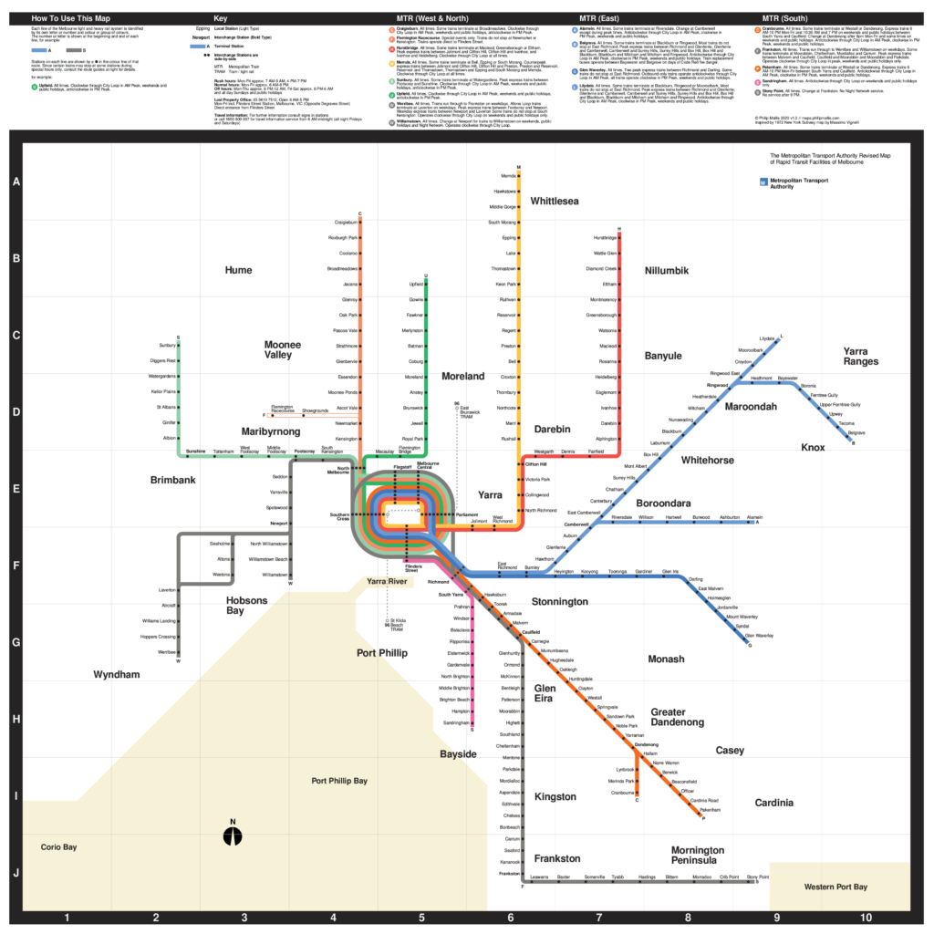
If you have heard of New York’s subway system, chances are you’ve come across this controversial 1972 map designed by the renown modernist designer, Massimo Vignelli.
The aim of my project is to recreate Melbourne’s rail network in the same style and pay homage to a much-maligned creation.
Below is my suggested soundtrack for reading this post if you’d like some appropriate background music.
The Network
I have depicted the current metropolitan passenger rail network as it stands in 2020.
As you may have noticed, I have also included the route 96 tram on this map. Given this is a map of Melbourne, I wanted to include at least one tram route. Why the route 96 specifically? It’s the closest thing that we have to light rail, being separated from vehicle traffic for most of its route, and it now has 100% accessible stops.
I have also taken some small liberties of rebranding the network to reflect the original work more closely.
For example, creating a new ‘Metropolitan Transport Authority’ (similar to ‘The Met’ and its various iterations) and designating a colour and letter for each line. Those familiar with my last map may recognise some similarities.
Other than these minor changes, everything else should be exactly as the current network operates. Given the complexity of describing the operating details of each line, I may have made some errors or omissions there. As always, I will rely on the extensive network of rail gunzels out there who thrive on pointing out this stuff – so please let me know if you notice anything wrong.

The Map
This map required a different design process to what I would normally use. It required a lot of preparation time studying the original 1972 map, as well as subsequent revisions and versions (both official and unofficial).
The original map is more square than rectangle-shaped so that is what I have used here, rather than any standard paper sizes. It is designed to be readable at roughly an A2 size.
I won’t go into the intricate detail of absolutely everything that went into the style. But as mentioned before, the overall principle was to draw as much inspiration as possible from the original map and follow it closely. This included:
- Minimising 45 degree angles, relying instead on 90 degree angles wherever possible
- Including extensive geographical distortion
- Including major water bodies and council names (in lieu of New York boroughs) but omission of other major features or landmarks
There are a few things that I would like to explain in a little more detail, mainly related to adapting this design to suit Melbourne’s network.
Design notes
Transfer stations on the original map are more complex – mainly by virtue of New York’s ticketing system. In New York, free transfers are not always applicable (i.e. when you are not penalised for changing trains or other public transport vehicles). In Melbourne, you are never charged for interchanging – which I think is one of the great virtues of our public transport system. This means that differentiating between free and non-free transfer points is not necessary.
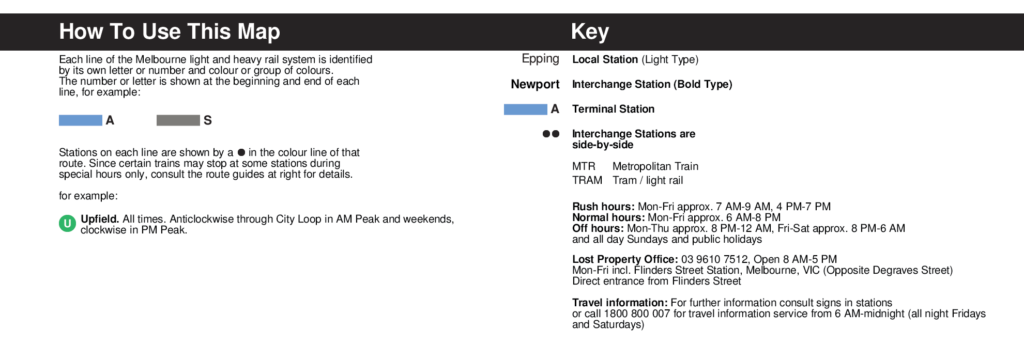
One thing that is quite different to the current branding of Melbourne’s rail network is the way that individual lines are treated. In the New York Subway, there is an intricate system of colours, numbers and letters to show the large variety of services. This is all incredibly confusing to me and I can’t quite get my head around how it works. As Melbourne’s lines don’t operate in the same way, I’ve adopted a hybrid approach. Each line has its own colour and letter, with branch lines sharing a colour (e.g. Williamstown and Werribee Lines).
The map’s legend at the top is also arranged a little differently. Because the New York Subway has several trunk line groups, this is how the original legend is organised. Melbourne’s network doesn’t have this system. Instead, I have split the three columns for convenience into West & North, East and South lines. The main reason for splitting East and South was the extensive explanations required for the Alamein/Belgrave/Lilydale lines, which have the most complex stopping patterns on the entire network.
One of the defining features of the 1972 map is the use of the iconic Helvetica font. There is this fascinating writeup on the topic and why a universal font was not used for the wayfinding design suite at the time, but either way, both Helvetica and Standard are commercial products that require an expensive license. I spent a lot of time trying different alternatives to come as close as possible to the original design. Freesans (licensed under GNU) is the best one that I found. I worked with Arial as an interim solution until I could find a better font, but Freesans is a fantastic alternative that I will probably use again.
Finally, I have not used exactly the original colour palette from the original map. Instead, most of the colours are slightly washed out to account for the fact that most copies of this design that I can find are scanned or otherwise a little rough around the edges. I think it lends itself to the grunge often associated with New York City and its subway.
FAQs
To anticipate some questions, I’ve included some additional information below.
Why haven't you included X station or Y line?
This map is not a map of rail proposals or gunzel fantasies. It only shows the current network as it stands in July 2020.
Why haven't you included Skybus?
I know that this is shown on the current official PTV map. However, I have chosen not to show it here for two main reasons: 1) I don’t believe that it should be on the PTV map in the first place (perhaps a topic that I can leave for another time); and 2) the Vignelli map doesn’t show any non-rail services. In the spirit of trying to stick as closely as possible to the original design, the Skybus service is not shown on here.
Why is the route 96 tram included?
I wanted to include at least one tram route on this map to give it a more ‘Melbourne’ flavour. As the route 96 is the closest thing that we have to light rail, being separated from vehicle traffic for most of its route, this is the one that I have chosen to include.
Future Development
As always, if you have any feedback or suggestions for improvement, please let me know.
