

How the Suburban Rail Loop will transform Melbourne’s transport maps
See the full project description and download link here.
It is difficult to overstate how transformative the recently-announced Suburban Rail Loop will be for Melbourne’s transport network. Without getting into the technical transport details, it will make intra-suburban and cross-city travel much easier than it is today.
One of the most significant aspects of the transport system that it will hopefully change is how we visualise and depict the network on maps.
Victoria’s existing radial network has proven to be quite limiting in its possibilities for cartography. The only logical focal point for a map of Melbourne’s rail network at present is the City Loop and the CBD.
Building these kinds of orbital lines opens up hundreds of new and exciting design possibilities. Schematic (or diagrammatic) maps are usually much better than geographical maps of showing transport systems to users, as I have explained before. Look at cities with these kinds of radial lines and you will generally find that they are much more varied, interesting and easier to use than cities with radial networks.
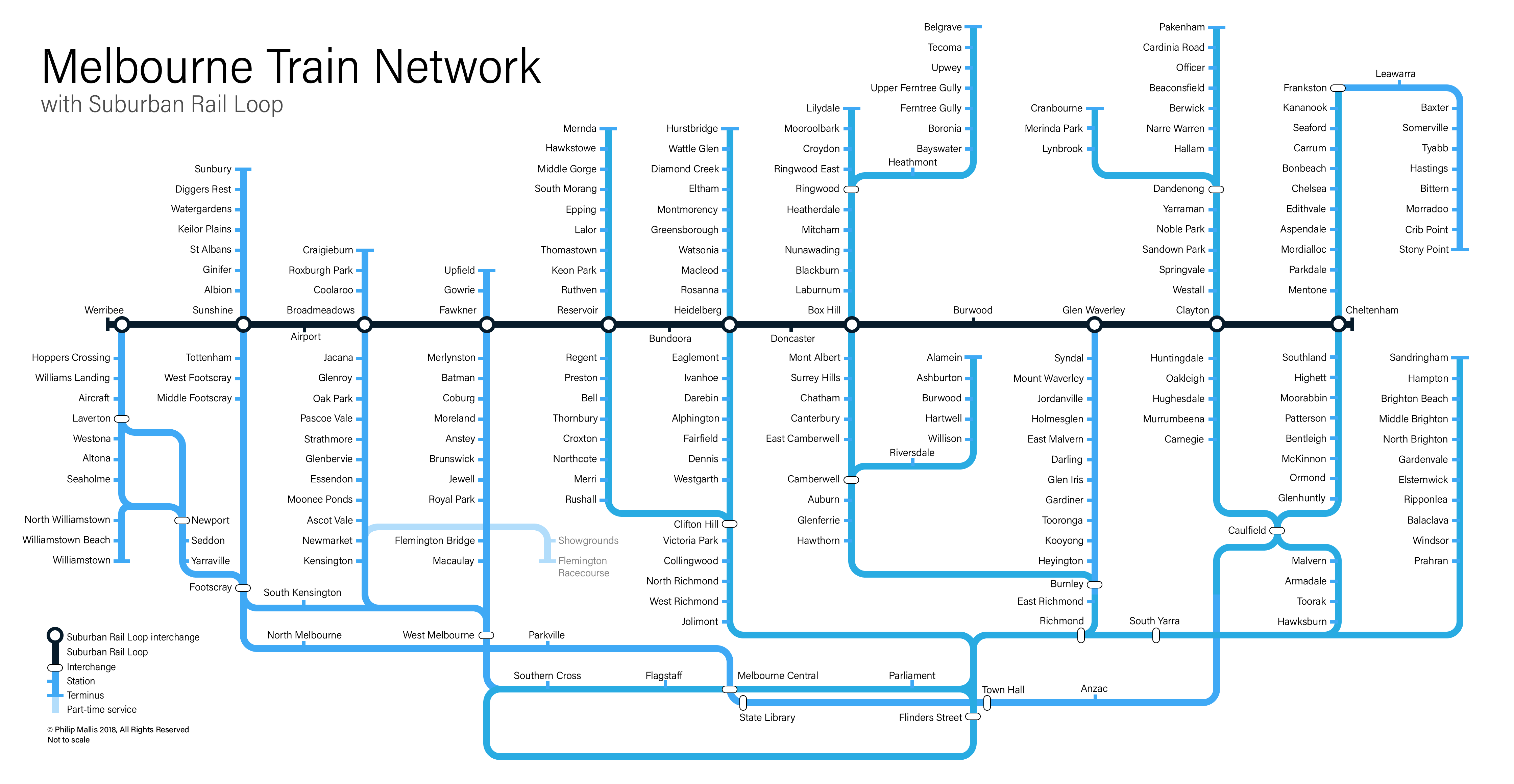
The map
Based on this thinking, I have put together a new map showing Melbourne’s rail network with the Suburban Rail Loop and Melbourne Metro 1.
As explained in the full project description, I have used the Suburban Rail Loop as the focal point of this new approach. Having it as a clear and straight line towards the centre of the canvas brings this new railway front-and-centre of the map.
This then allows all other lines to be designed around the central line. As it is schematic, I have tried to minimise the amount of wasted space by routing some lines in very different directions and fitting them in where I can (see the Flemington Racecourse and Stony Point lines for examples).
The simple colour scheme and clean sans serif font is designed to make the map as clear and readable as possible. Sometimes map designs can get a little carried away with artform and leave passenger useability by the wayside; I have tried to avoid that here (but I may have still failed, we’ll see!)
Next steps
I hope that this different design sparks some ideas in others for how our maps could be changed. Subject to spare time, I hope to build on this concept in the future and develop some other maps using the opportunities provided by this latest project. Smartbus routes could be one potential inclusion.
As always, if you have any feedback, suggestions or corrections, please let me know.
2 Comments
Join the discussion and tell us your opinion.
That’s grouse. I have been reading the Melways since a kid too!
The TfL route maps are a bit like Melbourne’s tram maps and your loop design. A line along the route you are travelling, with intersections for cross lines. These are moderately useful and make simple linear posters. However you have included the whole system in one diagram.
Beck’s main map is however roughly geographic. it is famed for this simplicity. This meets the traveller’s need in showing where they are going and when I have used it I have long found it the more useful format. The only flaw in Beck’s design is that it could be more geographic. When getting across from one stop to another, stations can appear further apart or closer than is real. As an example Hampstead Heath and Belsize Park appear well separated, but the crow-flying distance is about 0.5 km.
The Melways does not reformat the roads and neither should you propose it for our railways.